
Jayne Davids draws upon her experience in creating hundreds of guides and help documents to distil the essential best practices for creating user-friendly resources
People visit a knowledge base or help centre to get answers or information about a product or task. Providing well-designed help content enables customers and internal staff to help themselves and find answers and information quickly and easily. For the business, enabling customers to self-serve can reduce the number of support calls and empowers users to be successful in using the product.
Help content does not need to include everything
Effective help content involves designing something that’s user friendly, easy to navigate and can be understood by people of all abilities.
Here are five high-level tips for creating better help content.
Tip 1: Clear and concise language
- Use simple and straightforward language.
- Leave out the jargon and avoid the long-drawn-out overload of information.
- Get to the point in as few words as possible but make sure you cover all the necessary steps.
- Make it as easy as possible to understand.
Tip 2: Visual aids and multimedia
Images and videos offer a visual representation of the step or process. They give context, reinforce the information, and can enhance the learning experience.
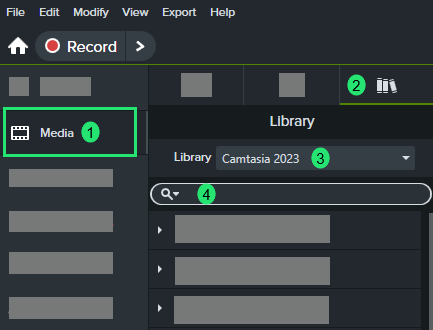
Visual clues can be added to draw attention to what is important. For example arrows, highlights, and spotlights. The image below uses a coloured step indicator that offers a visual clue to a process. The image has been simplified, meaning the irrelevant and extraneous content has been hidden, drawing focus to the important parts.
How-to videos are a fantastic way to demonstrate a process. These should be clear of clutter and easy to follow. Just like with images, effects and visual clues can be added to enhance the video. These should be used with care to make sure they enhance the learner experience and not distract. Be mindful that quick movements can have a negative effect on the viewer.
When adding effects and visual clues to images and videos, make sure they have a purpose and will benefit the learner.
There are key principles for making smart graphics that facilitate learning. To learn about principles of visual design, check out Connie Malamed, an art educator and instructional designer.
Tip 3: Structured formatting
Organised and structured formatting provides easy navigation. Keep it simple and consistent to enable customers to scan and process it quickly.
Provide a short and specific title describing the task or concept.
Break content down into small digestible chunks and provide clear headings.
Create a style guide to standardise the way text and visuals look, this will enable the team to create consistent content efficiently. Include things such as colour palette, typeface, font size, line spacing between headings and paragraphs.
Help content does not need to include everything. Determine the most important things people need to know, then any extra information that could be useful can be hyperlinks.
Tip 4: Accessibility and inclusivity
Accessibility author Susi Miller says that, “Making learning and development content inclusive and accessible to everyone is not only a good thing, it’s the right thing to do.” You can hear more from Susi on accessibility in the TJ podcast.
By making help content accessible it will enhance the learning experience for everyone. For example, captions are used by sighted people as well as those with additional hearing needs.
You can take the first steps to inclusive design by starting with the following:
- Including alternative (ALT) text in image (and read more WebAIM alternative text)
- Adding captions to videos: The Complete Guide to Captioned Videos by Meryl Evans
- Having a good colour contrast
Text is difficult to read if the colours between the text and the background do not have a good colour contrast, e.g. yellow text on a white background as per the image below. There are free and easy to use online tools that shows you whether the colours pass the standard guidelines set by Web Content Accessibility Guidelines. The image below is using the WebAIM contrast checker.

Tip 5: Regular updates
Perform regular audits to ensure the help content is still relevant and up to date. Hyperlinks within help articles can often become broken, so it is good practice to test these regularly to check they still work as intended.
A helpful experience
Crafting effective help content is not just about delivering information; it’s about creating a seamless, engaging experience that empowers users to find solutions independently. By adhering to tips, organisations can greatly enhance user satisfaction and efficiency. The goal is to make your knowledge base or help centre not just a resource, but a valuable extension of your product or service that fosters self-reliance and confidence in your users.
Jayne Davids is an L&D Specialist and Systems Trainer at her company Raiveon